#### 先贴两张效果图:
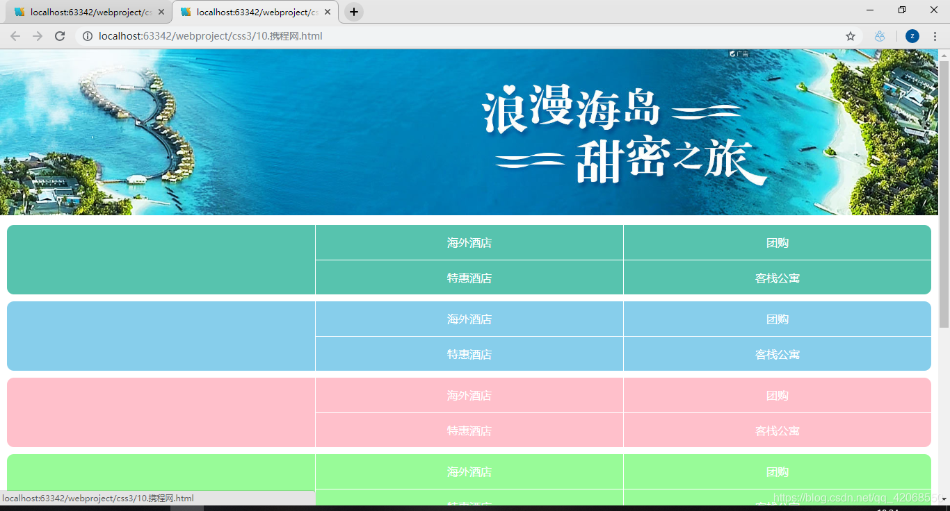
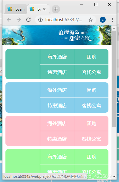
要求
网页伸缩放大布局会自适应变换
用到的新属性
display: flex
Flex是Flexible Box的缩写,意为”弹性布局”,用来为盒状模型提供最大的灵活性。设为Flex布局以后,子元素的float、clear和vertical-align属性将失效。
flex:
当父元素使用display: flex后,子元素会具有弹性布局,子元素设置flex属性后面接数字,例如:flex:1,表示该子元素在该父元素的所有子元素中大小占一份,就会自适应宽度
box-sizing:border-box
为元素设定的宽度和高度决定了元素的边框盒。
就是说,为元素指定的任何内边距和边框都将在已设定的宽度和高度内进行绘制。
通过从已设定的宽度和高度分别减去边框和内边距才能得到内容的宽度和高度。
flex-wrap:wrap
让弹性盒元素在必要的时候拆行。使其不再收缩。
携程网案例
1
2
3
4
5
6
7
8
9
10
11
12
13
14
15
16
17
18
19
20
21
22
23
24
25
26
27
28
29
30
31
32
33
34
35
36
37
38
39
40
41
42
43
44
45
46
47
48
49
50
51
52
53
54
55
56
57
58
59
60
61
62
63
64
65
66
67
68
69
70
71
72
73
74
75
76
77
78
79
80
81
82
83
84
85
86
87
88
89
90
91
92
93
94
95
96
97
98
99
100
101
102
103
104
105
106
107
108
109
110
111
112
113
114
115
116
117
118
119
120
121
122
123
124
125
126
127
128
129
130
131
132
133
134
135
136
137
138
139
140
141
142
143
144
145
146
147
148
149
150
151
152
153
154
155
156
157
158
159
160
161
162
163
164
165
166
167
168
169
170
171
172
173
174
175
176
177
178
179
180
181
182
183
184
185
186
187
188
| <!DOCTYPE html>
<html>
<head lang="en">
<meta charset="UTF-8">
<title></title>
<style>
*{
padding: 0;
margin: 0;
}
header{
width: 100%;
display: flex;
}
header >a{
flex: 1;
}
header >a >img{
width: 100%;
}
main{
width: 100%;
padding: 0 10px;
/*设置盒模型*/
box-sizing: border-box;
}
main > .item{
width: 100%;
height: 100px;
background-color: #57c3ae;
border-radius: 10px;
margin-top: 10px;
display: flex;
}
main > .item >.left{
flex: 1;
}
main > .item >.right{
flex: 2;
/*设置换行显示*/
flex-wrap: wrap;
/*设置为伸缩盒子*/
display: flex;
}
main > .item >.right >a{
/*如果想让子元素换行显示,必须为子元素设置宽度*/
box-sizing: border-box;
width: 50%;
display: block;
text-align: center;
line-height: 50px;
color: #FFFFFF;
text-decoration: none;
border-left: 1px solid #fff;
border-bottom: 1px solid #fff;
}
main >.item >.right >a:nth-last-child(-n+2){
/*去除下面两个标签的下边框*/
border-bottom: none;
}
main >.item:nth-of-type(2){
background-color:skyblue;
}
main >.item:nth-of-type(3){
background-color:pink;
}
main >.item:nth-of-type(4){
background-color:palegreen;
}
main >.extra{
width: 100%;
display: flex;
}
main >.extra >a{
flex: 1;
}
main >.extra>a>img{
width: 100%;
}
/*底部块样式*/
footer{
width: 100%;
font-size: 13px;
}
footer >nav{
width: 100%;
display: flex;
border-top: 1px solid #cccccc;
border-bottom: 1px solid #cccccc;
}
footer >nav >a{
flex: 1;
line-height: 30px;
text-align: center;
color: #888;
text-decoration: none;
}
footer >.link{
text-align: center;
line-height: 25px;
margin-top: 10px;
}
footer .copy{
text-align: center;
margin-top: 10px;
}
</style>
</head>
<body>
<div class="container">
<header>
<a href="">
<img src="banner.jpg" alt=""/>
</a>
</header>
<main>
<section class="item">
<div class="left"></div>
<div class="right">
<a href="">海外酒店</a>
<a href="">团购</a>
<a href="">特惠酒店</a>
<a href="">客栈公寓</a>
</div>
</section>
<section class="item">
<div class="left"></div>
<div class="right">
<a href="">海外酒店</a>
<a href="">团购</a>
<a href="">特惠酒店</a>
<a href="">客栈公寓</a>
</div>
</section> <section class="item">
<div class="left"></div>
<div class="right">
<a href="">海外酒店</a>
<a href="">团购</a>
<a href="">特惠酒店</a>
<a href="">客栈公寓</a>
</div>
</section> <section class="item">
<div class="left"></div>
<div class="right">
<a href="">海外酒店</a>
<a href="">团购</a>
<a href="">特惠酒店</a>
<a href="">客栈公寓</a>
</div>
</section>
<section class="item">
<div class="left"></div>
<div class="right">
<a href="">海外酒店</a>
<a href="">团购</a>
<a href="">特惠酒店</a>
<a href="">客栈公寓</a>
</div>
</section>
<section class="extra">
<a href="">
<img src="extra1.png" alt=""/>
</a>
<a href="">
<img src="exra2.png" alt=""/>
</a>
</section>
</main>
<footer>
<nav>
<a href="">电话预定</a>
<a href="">下载客户端</a>
<a href="">我的订单</a>
</nav>
<p class="link">
<a href="">网站地图</a>
<a href="">ENGLISH</a>
<a href="">电脑版</a>
</p>
<p class="copy">©2015携程旅行</p>
</footer>
</div>
</body>
</html>
|