### CSS3 text-shadow 属性
实例
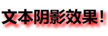
基础的文本阴影效果:
1
2
3
| h1{
text-shadow: 5px 5px 5px #FF0000;
}
|
效果图:
语法
text-shadow: h-shadow v-shadow blur color;
注释:text-shadow 属性向文本添加一个或多个阴影。该属性是逗号分隔的阴影列表,每个阴影有两个或三个长度值和一个可选的颜色值进行规定。省略的长度是 0。
值 |
描述 |
h-shadow |
必需。水平阴影的位置。允许负值。 |
v-shadow |
必需。垂直阴影的位置。允许负值。 |
blur |
可选。模糊的距离。 |
color |
可选。阴影的颜色。 |
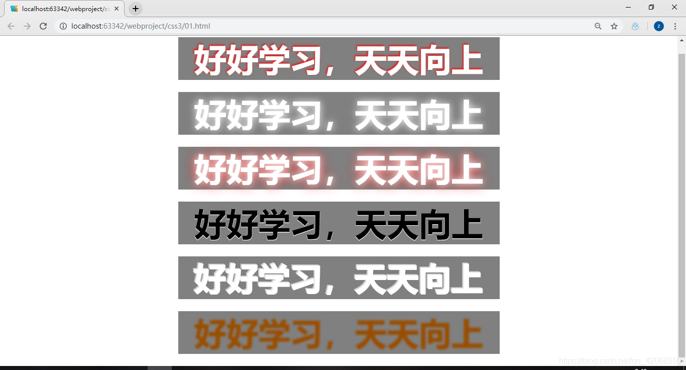
小案例:
1
2
3
4
5
6
7
8
9
10
11
12
13
14
15
16
17
18
19
20
21
22
23
24
25
26
27
28
29
30
31
32
33
34
35
36
37
38
39
40
41
42
43
44
45
46
47
| <!DOCTYPE html>
<html>
<head lang="en">
<meta charset="UTF-8">
<title></title>
<style>
.demo{
font-size: 80px;
background-color: #808080;
width: 800px;
margin: 30px auto;
text-align: center;
color: white;
font-weight: bolder;
}
.demo1{
text-shadow: -2px -2px 8px red;
}
.demo2{
text-shadow: 0px 0px 30px #fff;
}
.demo3{
text-shadow: 0px 0px 30px #fff,0px 0px 50px red;
}
.demo4{
color: black;
text-shadow: 0px 1px 0px #fff;
}
.demo5{
color: white;
text-shadow: -1px -1px 0px #eee,-2px -2px 0px #ddd ,-3px -3px 0px #ccc ,-4px -4px 0px #bbb;
}
.demo6{
color: transparent;
text-shadow: 0px 0px 8px hsla(30,100%,30%,1);
}
</style>
</head>
<body>
<div class="demo demo1">好好学习,天天向上</div>
<div class="demo demo2">好好学习,天天向上</div>
<div class="demo demo3">好好学习,天天向上</div>
<div class="demo demo4">好好学习,天天向上</div>
<div class="demo demo5">好好学习,天天向上</div>
<div class="demo demo6">好好学习,天天向上</div>
</body>
</html>
|
效果图: