CSS3动画
## 什么是 CSS3 中的动画?
动画是使元素从一种样式逐渐变化为另一种样式的效果。
您可以改变任意多的样式任意多的次数。
@keyframes
- 语法:@keyframes animationname {keyframes-selector {css-styles;}}
通过 @keyframes 规则,您能够创建动画。
创建动画的原理是,将一套 CSS 样式逐渐变化为另一套样式。
在动画过程中,您能够多次改变这套 CSS 样式。
以百分比来规定改变发生的时间,或者通过关键词 “from” 和 “to”,等价于 0% 和 100%。
0% 是动画的开始时间,100% 动画的结束时间。
为了获得最佳的浏览器支持,您应该始终定义 0% 和 100% 选择器。
CSS3 动画属性
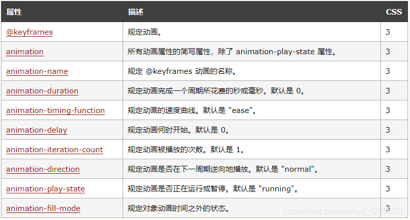
实例
运行名为 myfirst 的动画,其中设置了所有动画属性:1
2
3
4
5
6
7
8
9
10
11
12
13
14
15
16
17
18
19
20
21
22
23
24
25
26
27
28
29
30
31
32
33
34
35
36
37
38
39
40
41
42
43
44
45
46
47
48
49
50
51
52
53
<html>
<head>
<style>
div {
width: 100px;
height: 100px;
background: red;
position: relative;
animation-name: myfirst;
animation-duration: 5s;
animation-timing-function: linear;
animation-delay: 2s;
animation-iteration-count: infinite;
/* 规定动画应该无限次播放。 */
animation-direction: alternate;
/*动画应该轮流反向播放。*/
animation-play-state: running;
/*规定动画正在播放。*/
}
@keyframes myfirst {
0% {
background: red;
left: 0px;
top: 0px;
}
25% {
background: yellow;
left: 200px;
top: 0px;
}
50% {
background: blue;
left: 200px;
top: 200px;
}
75% {
background: green;
left: 0px;
top: 200px;
}
100% {
background: red;
left: 0px;
top: 0px;
}
}
</style>
</head>
<body>
<div></div>
</body>
</html>
另外一种简洁写法:
1 | div |